[in]pertinente
Identity design and animated title sequence
Fundação Francisco Manuel dos Santos
20
21
#animation, #identity design, #motion graphics, #music, #strategy
collaborations:


identity design
of inPERTINENTE
The concept behind the name “inPERTINENTE” is rooted in the idea of being “inside” or “enclosed” in the world of global issues, as well as the idea of being “pertinent” or relevant to current events. The play on the word “impertinent” adds a sense of irreverence and a fresh perspective to the subject matter.
It suggests that the show and podcast approach global issues in a new and unconventional way, while still being relevant and informative.
The TV show logo for [in]PERTINENTE features the word “In” enclosed in apostrophes, with the word “pertinent” written below it.
The apostrophes are meant to symbolize the idea of a conversation or dialogue, as well as emphasizing the show’s focus on global issues. The word “pertinent” is written in a modern font, emphasizing the show’s relevance and timeliness.
For the podcast logo, we have the letters “IN” inside a pair of stylized headphones symbolizing the audio-only format of the podcast with a more personal and intimate approach.
The overall design is simple, yet impactful, making it easy to recognize and remember.
InPertinente
title sequence
The online video show was a thought-provoking and informative program that delved into current global issues through in-depth interviews with a diverse group of international experts. The show’s unique format with Pedro Pinto as an engaging host provided viewers with a deeper understanding of the complex international topics that affect us all.
campaign design
We used an artistic illustration and animation of abstract architectural elements passing by in front of a starry night sky as the opening for the show and as the main element in all designs to convey the idea of progress, growth, and development.
The abstract architectural elements represent the building blocks of progress and growth, while the starry night sky represents the infinite possibilities and the vastness of the world.
The animation of the elements passing by in front of the starry night sky creates a sense of movement, change and evolution. It suggests that the show will be about exploring and understanding the world, and the many different ways in which it is constantly changing and developing.
The animation also creates an immersive and engaging experience, which can be used to introduce the show and set the tone for the content.
Using this concept throughout all designs, whether it’s on the website, social media, or other marketing materials, creates a consistent visual identity for the show, and reinforces the idea of progress, growth and development.
The abstract architectural elements can be used in different ways creating a cohesive and memorable visual identity for the brand.


related works

E-Motions
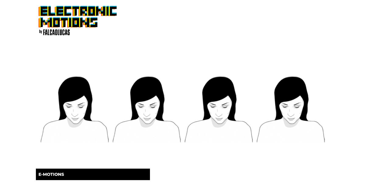
To experience it, visit electronic-motions.com first draft and first animation https://falcaolucas.com/wp-content/uploads/2025/08/alegriaAlpha.mp4 Happiness Anger apathy Sadness

pandemons
A short animation about the virus that swept the world and the social isolation that kept us apart.

el dorado
Lyric music video created for Shaylen single “El Dorado”, commissioned by Republic Records.

ontem
Music video for the music Ontem (Yesterday) by our music band Turvos that became a surreal short film about a journey through introspection.

